I had a number of topics I wanted to research. For example, Logo Design, Business Card Design, Graphics in Fashion, Machine Embroidery, Fashion and Textile Periodicals, and of course a visit is never complete without a random visit to the historical fashion archives to visit some of the great fashion masters.
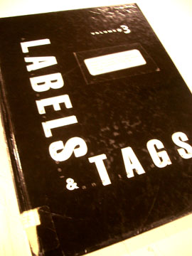
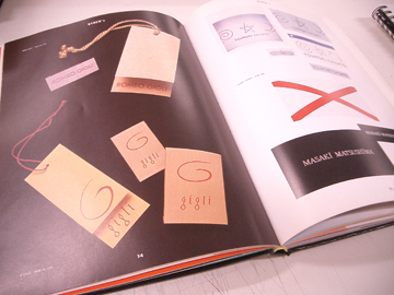
I grabbed many books, flipped through a lot of duds, but found this nice book with many visual examples of different labels and tags from the garment industry. I did notice that a lot of fashion houses do use actual graphic logos like one commenter pointed out.
I accidentally found a book titled The Paris Collection: Invitation Cards. It is complied by a Japanese fashion journalist, a visual collection of selected invitation cards to Paris Fashion Week Shows. It was a great way to look at the graphics and the designs used. Much more relevant than all the graphic books I flipped through that talked about Dunkin' Donuts design.
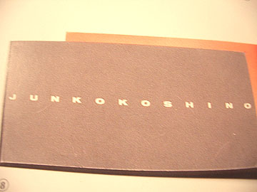
I found this one invitation card where the logo really appealed to me. It is short and fat in it's individual type. But in its totality, it is long and lean. So I might explore this type direction, even though there are only five letters in my brand name.
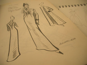
And finally a snap shot of a Balenciaga sketch. It's not an actual sketch from the hands of Mr. Balenciaga, rather a sketch based on one of his designs. It's all good. Upper right hand corner you can get a glimpse of my own sketch book.
1 comment:
The short fat font you posted is very difficult to read. I prefer something boxy, like Gucci.
What about colors or effects? Have you thought of using gold accented color, instead of simple white? How about an embossed effect? It will probably cost more but it will definitely be distinctive.
Post a Comment